How Livilit's navigation update improved user experience
Livilit's navigation system limited the integration of new features, leading to suboptimal user experience and reduced conversion - the redesign aimed to create a navigation structure that accommodates changes seamlessly while maintaining usability.
Client
Livilit Inc.
Industry
Real Estate
Discipline
Responsive Website
About the client
Livilit wants to shake up the real estate market and give people an innovative and powerful way to buy, rent, and sell real estate. The goal is to elevate the experience of real estate transactions and increase transparency.
It's an immersive triple-threat: You can buy, rent, or sell a piece of real estate and find realtors, mortgage agents, and lawyers who may be required to complete the transaction and follow the process in real-time. As the platform caters to multiple professions, there are challenges for usability, product experience, and conveying trust.
Asks
Livilit's navigation update aimed to allow new features to be launched. As the site launched in beta with just buying and renting, many additions were incorporated for the redesign. Fresh additions include Renting, Commercial leasing, Realtors, Mortgages, Lawyers, Inspection, Insurance, Currency, and language selection.
Challenges
Users were dropping out of the flow without searching for a home.
Many professionals signed up with the wrong account type. Once signed in, many professional users dropped out because of their inability to find the professional account sign-up path.
Analysis
User Feedback
Early access users found it challenging to locate the link to switch to a professional account as it was not in the marketing pages or the header bar. It was clear that users desired a straightforward way to switch between account types. Many users also cited that the primary reason for not signing up was that the platform did not appear as useful as Realtor.com or Airbnb.
Data
Out of 257 early-access professional users, 49 signed up with a buyer account instead of a professional account. They had to be changed over to a professional account. 67% of all early access users surveyed indicated they did not sign up for a user account.
Goals
As the website is adding features, a header design that scales with future additions is required. It should also follow the current mental models that users have learned.
Decrease drop-outs on the landing page and make it easier for users to search for homes that they would prefer.
Decrease wrong account sign-ups. Users can choose to switch accounts, but they should clearly understand which account to sign up for.
Minimize resistance to signups by adding messaging on how Livilit can help.
Research
To tackle these problems, I examined competitors within the same industry with multiple listing and account types. I looked into products like Realtor.com, Rentfaster, and Rentals.ca. All products employ similar information architecture and user flow. Realtor.com, for instance, used the same architecture as the old navigation bar, as it only has a buy-and-sell option. With rentals added, this design would no longer work. Rentfaster and rentals.ca use a hamburger menu to hide relevant links. The search bar is a common component shared by all platforms to help move users on the search page. Both platforms use a toggle bar to change language preferences.
Competition
Realtor.ca
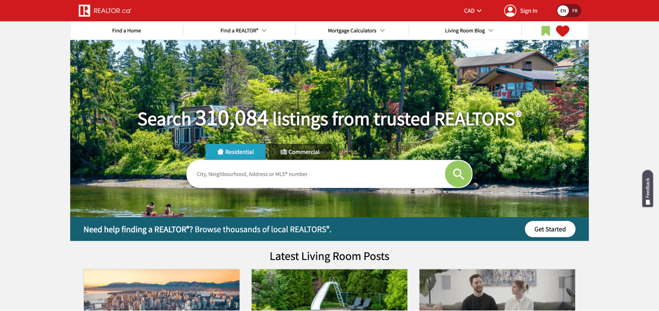
Saved searches and My Favourites seem to be features that are available on many sites, but the intent is not communicated clearly with the icons used. Using copy instead of icons should solve this issue. Currency dropdown is good to have for new visitors, but repeat users would not need it as the preferences are already established. The language selection is using a toggle. It would be better to put currency and language under global settings to save space.
Rentfaster
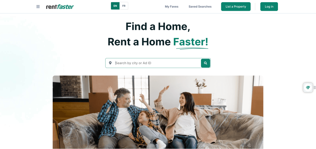
Some of the issues on realtor.ca exist on rentfaster too. Navigation links are hidden inside a hamburger menu impacting accessibility. 'Create an account' is not shown in the header which saves space as creating an account is not one of the primary goals of the user. The 'List a property' button is shown on the header as this function is available to all users on rentfaster compared to realtor.ca where only realtors are allowed to post a property.
Rentals.ca

Rentals.ca follows the same information architecture as Rentfaster. Main nav links are on the header bar which is a welcome addition. There are no Saved searches and My Favourites links on the header or the hidden menu bar. The search bar is also the same as the other platforms. This experience can be improved and represents a significant opportunity for the platform.
Solutions
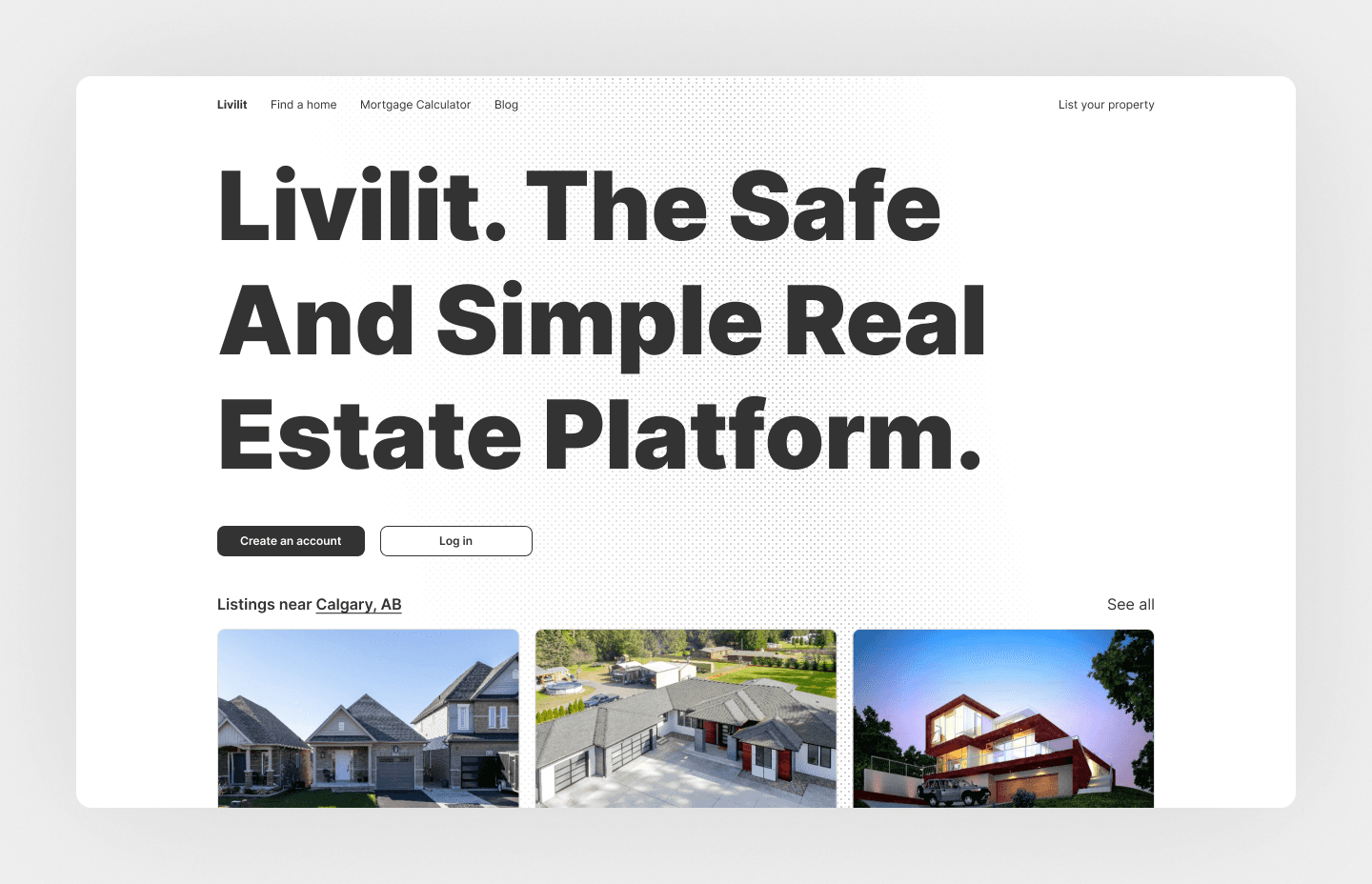
Option 1
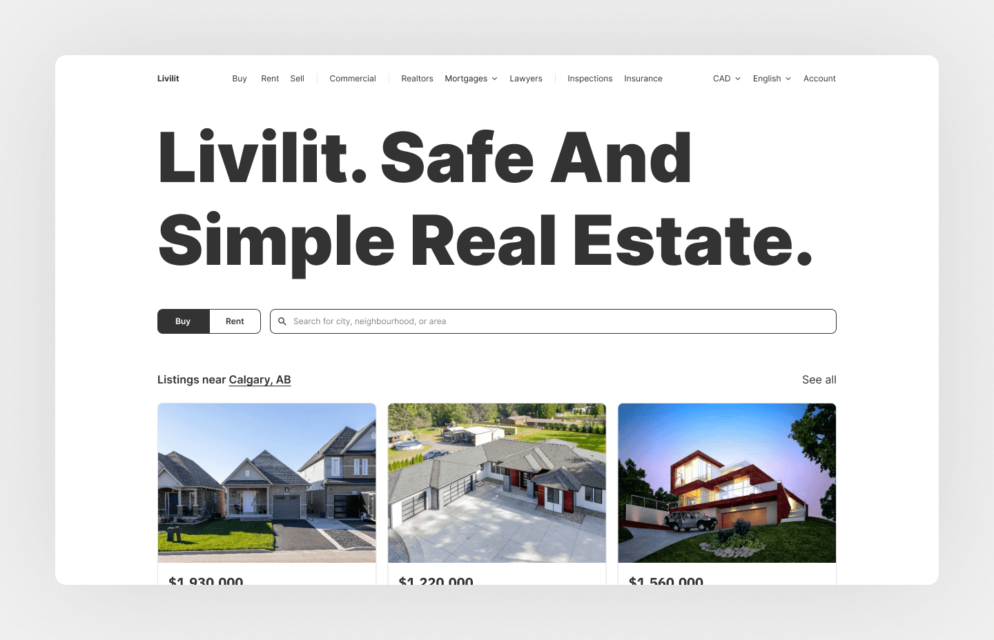
This option is based on the design and information architecture that we see on the competitor websites. A consolidated header bar design houses the main nav links and has space for the addition of future links. The search bar helps users navigate to the search page without friction than using the find a home link on the header bar. Users can easily switch from Buy to Rent with the toggle beside the search bar.
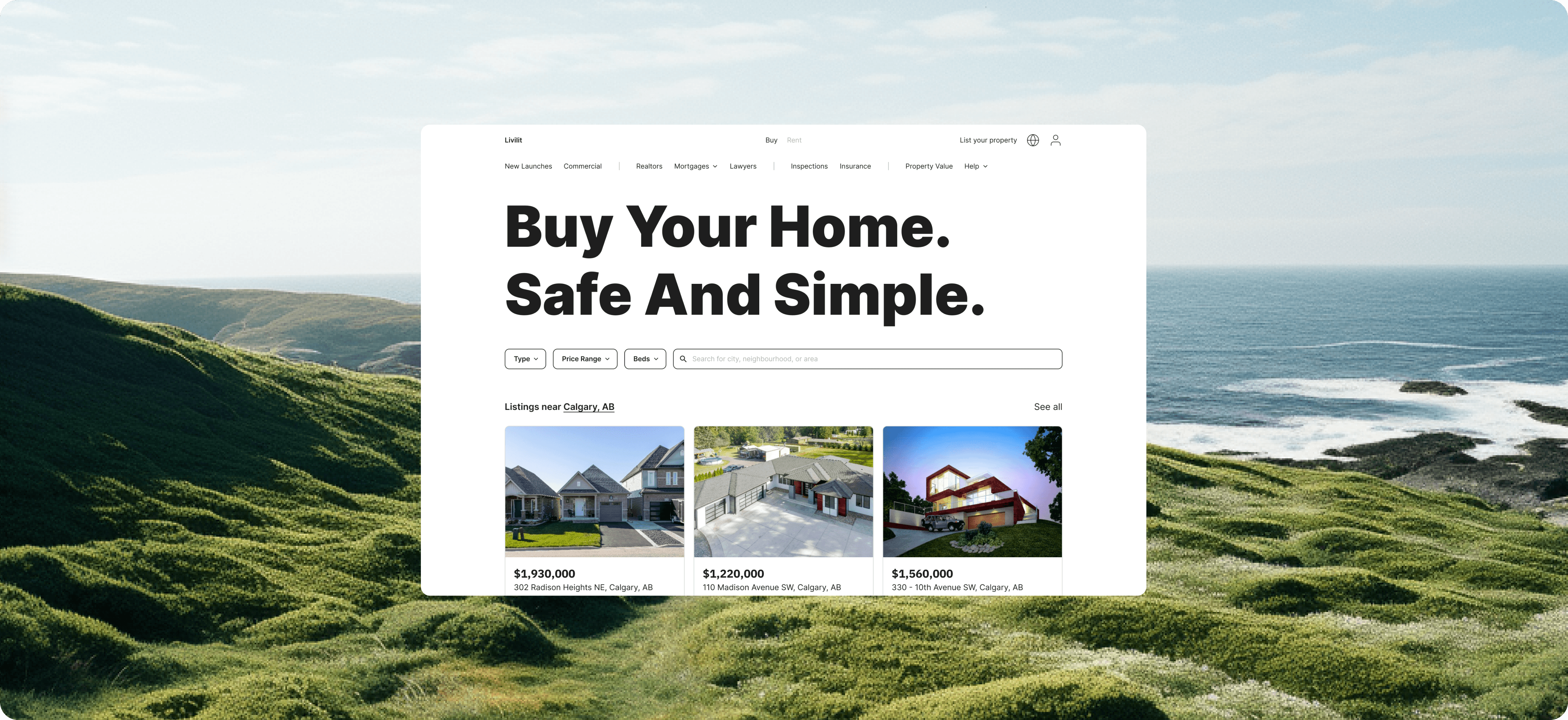
Option 2
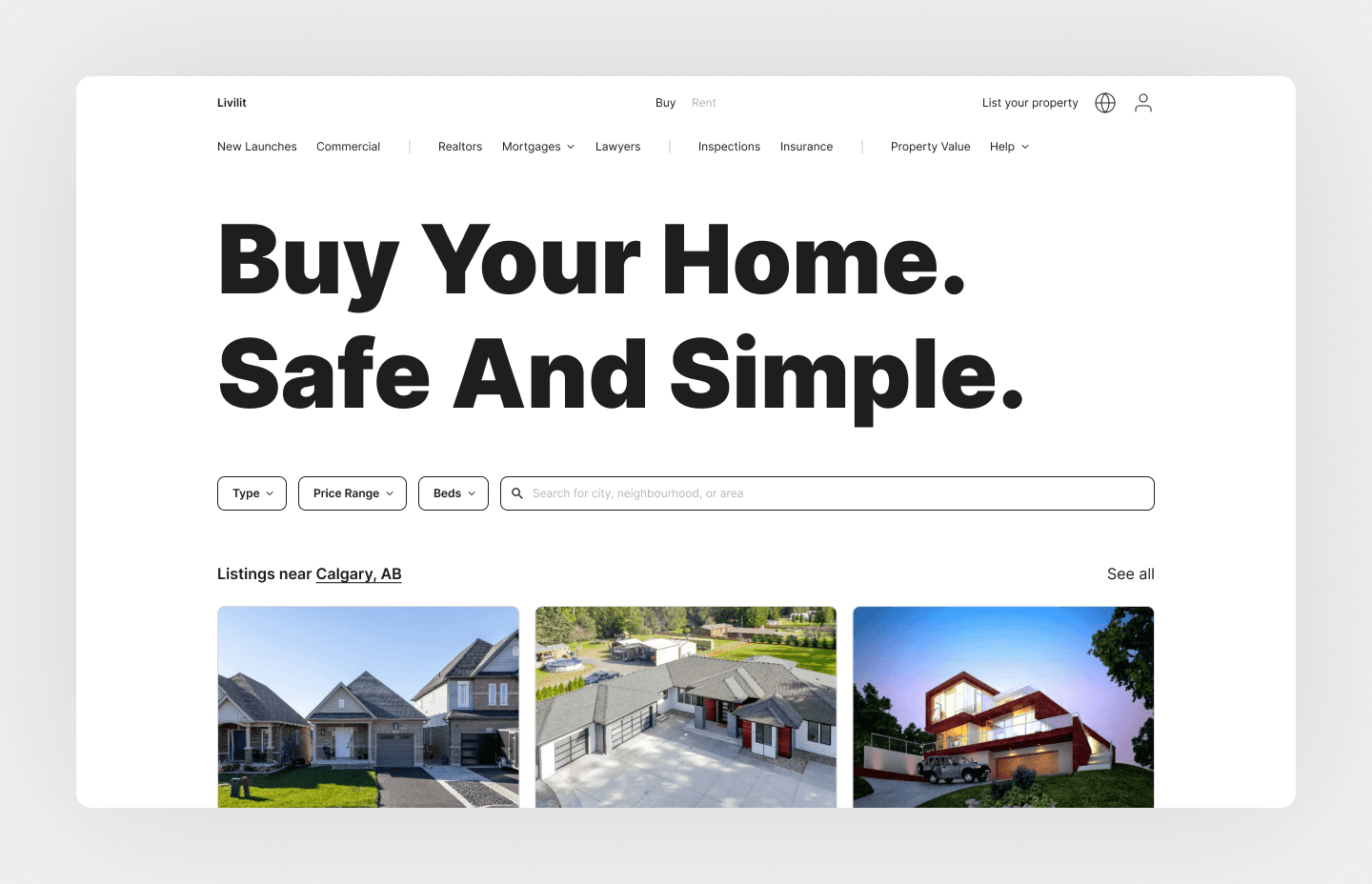
This option is a redesign of the Nav system. The idea is that the UI should change based on users' needs. The tab design at the top helps with swapping out the content below to orient itself to Buyers or renters. All the contents below including the secondary header contents, the banner copy, and the search bar filters are focussed on the specific user, in this case, buyers. Some options are consolidated into their groups. Filters help users to be more specific about their search and get more helpful results. Sign-up and log-in for all user account types are housed in the user icon on the header.
How Option 2 helped Livilit
The new design significantly decreased drop-offs. Professional user sign-ups have increased as the user icon consolidates all account sign-ups. The space saved helps content breathe and there is a focus based on the user browsing the website. Secondary header addition also helps Buyers and Renters easily find professionals. Bringing the "List your property" button to the main page also allows sellers and landlords trying to list a property themselves.
Results
This approach yielded impressive results. Not only did we see better conversion rates for new users, but the overall usage of the website increased. The drop-off due to profile sign-up mistakes also saw a reduction.
Takeaway
My key takeaway is to not reinvent the wheel and use patterns that users are already accustomed to. Grouping functions/features that are in a specific category into the same sections helps save space and works with the user's mental model helping easy navigation and findability.